I was commisioned to create a vector portrait for the two people in the image. Its something i was experimenting with for a while in order to get the correct style, after researching so many different solutions. I settled on a simple 3 or 4 tone design in order for it to be simple but at the same time look like the people in the image.
I created this in Illustrator as a birthday present to the girl in it. I wanted to play around with different ways of capturing someone in a portrait graphically and using type was one way i wanted to explore. I feel the result is good and will be experimenting more with type in the future.
I wanted to play upon the trend we have to constantly use the image of che guvara. It interests me how easily we use this iconic image and manipulate it for modern use. Is the idea more iconic than the person himself?
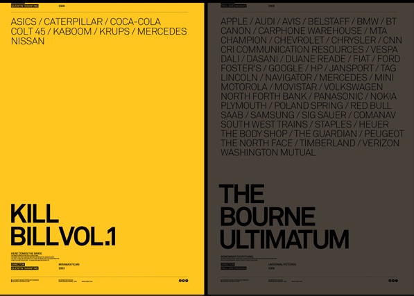
I like the idea of designing concept films posters and this i like very much from Peter Sciretta. The idea is to use all the adevertising and brands featured in the movie and place them on the poster. The idea is great and the excecution is also very stylish and remenicent of Peter Saville's Factory Record's designs.
another experiment in my "legibility is overrated" series. i used Illustrator to create the EPS of the lines amd dots with the help of the pathfinder tool. i feel the result is successful due to the fact it can be quite off putting to read, and as a result not very legible.
Brief was to create new covers for the Oxford range of dictionary and thesaurus'. The covers had to exciting and visually attractive, as well as making language and words exciting. My solution was to create everyday objects out of words and type; to be minimal but interesting. This theme would run throughout the covers and i feel its very successful.